Wednesday 26 November 2014

First Front Cover Mock-Up


I am using fireworks to create my music magazine. I started off with my image and I enlarged it so things in the background can be cropped out. This makes it a close-up image. I then edited my picture to make it more brighter. I then made a masthead. I wanted my masthead to be large and for it to go across the page so it stands out. I also changed the spaces between my letters so that it is clear. Then I added the headline. The headline 'Laura Cooksey' is in a large font because it is the first thing my audience will look at. Finally, I added my cover lines. These are here to tell my audience what will be included in my magazine. I used a different colour for my cover lines so that all the font colour isn't the same.  There isn't that much writing on my front cover because I don't want it to be too confusing for my target audience

Friday 14 November 2014

Photo Planning

I am going to have my friend Laura Cooksey and my cousin Hope Lescott posing for my music magazine.  I am going to have a mixture of pictures so that it shows different themes so that they fit the genre of my magazine. The shots I will use are medium shots and close - ups. Some pictures will be of Laura looking directly at the camera so that shes showing eye contact . This is because, it could show the audience what there personality is like. Other pictures will be on Hope leaning against a wall. This could show a typical sterotype of a female RnB artist. The pictures are going to be different so that all the pictures aren't the same and so it shows a different style of image and that they are presented in different ways.

I will think about the way Laura and Hope will do their hair and make up so it fits the genre of RnB. I don't want all of my pictures to look the same because RnB celebrities are presented in different ways. I want my models to have a similar style to RnB celebrities such as Rihanna, Beyonce or Nicki Minaj. Here is my photo planning sheet :

These are some examples of some celebrity photoshoots:

Wednesday 12 November 2014

Brand Identity and Brand Values of my own music magazine


Brand Identity is how all the elements that contribute to the visual appearance work together to distinguish that brand in the mind of the audience/ consumer. This includes the use of colour, fonts, style of imagery, layout and house style. 

The brand identity for my music magazine is that my target audience is teenagers and young adults, therefore I can use a good mixture of colours, such as bright or dull so it suits the atmosphere of the magazine. The magazine will have a unique style so that it appeals to the audience. The house style will be consistent so my magazine will look professional.

Brand Values are things that are deemed important by a brand, the things that it stands for 
and what it represents.

My music magazine will be called 'Resonance' presents teenagers and young adults can show there deep passion for music, especially RnB music. It also wants the younger teenagers to expression there passion for music, whether it is singing or rapping. My magazine will support my audience because it will try and help the unfortunate people to achieve there dreams of music.

Monday 10 November 2014

Brand Identity and Brand Values of Billboard and Vibe Magazine


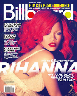
Billboard focuses on showing the audience about new artists they are advertising and upcoming events that are happening. The masthead 'Billboard' expresses that there is a good vibe towards the magazine. The magazine communicates with teenagers and young adults. They show this by using known artists such as Beyonce Knowles. It targets females and males, they show this by the style that they use. The magazine believes in showing there readers they have a positive attitude. The layout of the magazine shows it is an energetic magazine, however it does use dull colours but it still appeals to young children. The colours in the masthead suggests what the magazine is about and the vision it is trying to create on people.


Vibe focuses on showing there audience new songs that have been released by current RnB and Rap artists. The masthead 'Vibe' is very big and bold, however this could show a negative attitude towards some people and it could be a bad influence on them. It targets females and males but it mainly targets males, they show this by the layout they have used. The layout of the magazine that it is a dull magazine, however the magazine still appeals to teenagers and young adults.

Treatment for music magazine production


The title of my music magazine will be called Resonance and the genre of my music magazine will be RnB. I have chosen to do this genre because this genre of music is very current and a lot of people listen to it. This genre of music is good to focus on because RnB doesn't just focus on British people for example Jessie J, there are a lot of American RnB artists such as Beyonce. Upcoming music events will be featured in my magazine, and the latest news about celebrities will be advertised. New competitions and weekly interviews. My intended primary target audience for my product are for males and females teenagers aged 16 - 25. A young white female which will be aged around my target audience will be representing on my magazine. This challenges the typical stereotype of an RnB artist because they are predominately black people.  My audience will be mainstream. This is means I will produce my magazine so that different people will enjoy looking and reading it. My audience is also mainly for people who like to watch music awards shows such as EMA's, The Brits Awards or BET Awards.  My secondary audience are aimed at young adults and adults. RnB artists will be represented to the young adults in a way to show a positive attitude. It will also be showing an energetic vibe. I will use a range of bright colours and I will keep my font consistent throughout my magazine. I will choose an appropriate style to suit the genre of my magazine.